- a bar graph with one short bar for deciding on a premise, a slightly larger bar for finding appropriate data, and a very, very tall bar for the amount of time I spent determining how best to convey the information
- six cups of coffee
- seventeen "versions"
- a line graph of my mood as it ranged from optimistic to fatigued to dissatisfied to finally content
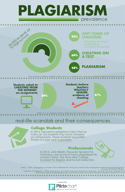
One of my biggest challenges was finding a color scheme. First, I wanted to use various colors, but they just seemed to convey a bit too much "fun" for such a serious topic. I tried red, but it looked too severe. I finally settled on different tints of a hunter green on a lightly patterned background.
Figuring out how to give credit to the sources of information was another struggle, because while credit is important, I did not want that text to overshadow the information. I decided to create dividing lines and place the citations right above them, so they would add to the separation in information. I did notice that I needed to attach a fairly large version of the info graphic to this blog, or the small citations would not be entirely legible.
If I have students create info graphics, I will definitely caution them to set aside a significant amount of time if they want to have a finished product that will make them feel proud. I would probably have them research the topic first, so they can find appropriate information, then guide them through determining what type of graphs and charts would be best for their data. I would ask them to brainstorm appropriate colors, fonts, and "images" that would best convey their message. After the prep work, I think they would have an easier job actually creating the info graphic. I think that the preparation and brainstorming would be a large portion of their final grade, because while the finished product is important, and they should learn some basic elements of appealing design, I know that this is incredibly difficult to do.
The best occasions for having students make infographics in my classroom would be when they write persuasive essays or give persuasive speeches. With an infographic, students could "illustrate" their research and the problem.
The best occasions for having students make infographics in my classroom would be when they write persuasive essays or give persuasive speeches. With an infographic, students could "illustrate" their research and the problem.

Fantastic (and depressing) infographic...I love your "creation of an infographic"-infographic discussion. I can "see"it in my mind and it's perfect. Especially the coffee/mood ratio. haha
ReplyDeleteYes, very meta. This is cool, but the data is sad.
ReplyDeleteI'm glad I'm not the only one who could have created a line graph of my mood. Looks really nice.
ReplyDeleteI also loved your amusing description of the creative process. So, did you give us all rights to use it? You know we want to.
ReplyDeleteSure!
ReplyDelete